Color psychology plays a subconscious yet substantial role in how we feel about certain settings.
At the most basic level, there are two types of colors that affect your mood; warm and cool colors.
You can recognize these two types easily on the color wheel where half the colors are on the warm side—red, orange, yellow—while the other colors are on the cool side—green, blue, and purple.
The identifiers warm and cool generally describe how these colors feel in a room; with warm tones helping you feel happy and energized when you enter a room, and the cool tones making you more relaxed and tranquil.
Knowing the effect of these colors on your mood will help you decide on a color direction to take when painting each room in your home.
Colors to warm up your space
- Red
Red is one of the most stimulating colors on the color wheel. It elicits the most powerful reaction out of all colors, with studies showing that red can cause physical effects such as elevated blood pressure, enhanced metabolism, increased heart rate, and increased respiration rate.
This is why painting a room a shade of red can help the space feel a lot more energizing and motivating. Red is also a color that’s often used in restaurants as it excites your appetite more than any other color.
Red works best in either your living room or dining room as it can supplement social encounters with energy and increase your appetite.
- Orange
Rooms that are painted in orange help to create warmth in a space, but also fill the place up with confidence and even creativity. It’s a very high-energy color and is more playful and fun than red.
The brighter the orange, the more the intensity.
A more brown-based shade of orange can create this effect but in a much more toned-down manner. This is a color that’s great for socializing as it injects lively energy into the room.
It can, however, be a polarising color that many people either hate or love, so it’s best to get professional advice on the right shade of orange or how you can accent it onto your walls in an aesthetically pleasing manner before you proceed.
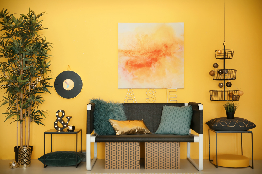
- Yellow
Color psychology has identified that yellow is a go-to color if you want to make a space feel happy. Being the lightest hue of the color spectrum, yellow feels cheerful and its association with sunlight also adds to this hopeful and uplifting feeling.
Muted yellows have the same type of effect without being too bright and in your face. With well-placed accents of a good bright yellow, you can create a room that makes everyone’s day just a little brighter.
This is the perfect color for a living room, entrance hall, or kitchen.
Colors to cool down your space
- Green
Rooms painted in shades of green tend to have a calming effect, as it’s a color associated with vitality, nature, and health.
A lighter and brighter shade of green can add an optimistic feeling to your space, while a darker shade can come off as more soothing and comforting.
This color would be a great option to add to your bedroom, so you can feel balanced and renewed.
- Blue
The color that has been deemed the most calming according to color psychology, is blue. It has been shown to slow down heartbeats and respiration in people, producing a feeling of restfulness.
Blue is the color you need if you want to leave your room feeling calm, cool, and collected. It’s also the color most recommended to boost productivity through feelings of comfort and relaxation, making it a great option to use for your home office or your bedroom.
- Purple
Purple is a pigment that has long been associated with royalty, producing a sense of wealth and abundance. It can, however, be either dramatic or soft depending on the tone or shade you choose.
For example, lighter lavender shaded walls can create a soft, calming energy. A more dark purple, on the other hand, creates a balanced, tranquil mood.
A bright purple can make a room feel as though it’s bursting with energy, making you feel inspired and creative but in a more focused manner. This color is best suited for your bedroom or study room.
Use color psychology to choose the perfect color scheme for your home
Color psychology tips help you identify the color that fits best in each room in your home, so you can match the room’s function with the mood created by the colors to spark the right kind of ambiance.
Whether you’re pairing communal spaces with warm colors or personal havens with cool colors, always remember that it’s best to get the help of professional painters to determine the feasibility of these color choices and to ensure that your home feels like a cohesive unit of spaces with a complementary color scheme.
Recent Comments